Often when I'm reading through other blogs or websites I see a lot of comments from people about the best way to lay out their furniture in a space. This is a recent issue that I had when we moved into our new house and I thought I'd show you a way to go about doing this on your own without physically moving your furniture around 10 times.
In design school and in my past jobs whenever we had a job, Space Planning is one of the first priorities. Basically we need to figure out how the room is going to function, what are the existing architectural features, how people will flow through it, what furniture needs to be placed?
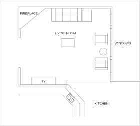
For example, the flow of traffic in our living room comes from two different directions; the front entry and the kitchen.
So I need to keep these areas free of furniture for the paths of travel. An ideal walkway in a room is 3'. In residential spaces that is not always an option so as little as 20" can work. Any smaller and you'll be constantly bumping into the corners of your furniture.
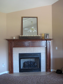
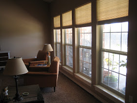
Once you have an idea of flow in your room think about the features your room has to offer. You'll want to highlight these. Our room has two major features- the fireplace and wall of windows.
Ideally I want my furniture to face the fireplace and let the windows stand out by not blocking them with a large or tall piece of furniture. I also needed to consider the placement of the TV. This is our main TV watching room so that would be a feature as well.
With these ideas in mind my first idea was to lay out the room like this:
I thought having the couch against the back wall would help anchor the space, and the two chairs would give a feeling of openness when viewing from the kitchen. But after looking at if for a while it seemed like the couch wall felt too "heavy" and the coffee table placement was odd.
So try number 2 gave me this:
I still have all my paths of travel, my furniture is facing both of my features (fireplace and TV) and the windows are readily visible (though I still need to hang curtains....)
This is the view in real life:
With the furniture pulled off the wall and placed in an "L" it creates a sense of closeness and encourages conversation. Everyone can see the TV and fireplace.
While I was doing this I played around to see what other configurations I could come up with, there's really no right or wrong answer.
I wondered what the room would be like with the TV on the opposite wall.
Again I have an "L" shape layout for the furniture, the sofa is on a large blank wall that could give me an opportunity to hang a large piece of artwork. But it seemed like the TV would be to far away and it also creates a path of travel right in front of the TV- not so good. And the fireplace seems to get a little lost.
If we had been able to hang our TV over the fireplace we would have had a layout similar to this:
This lays out nicely as well. It almost creates a "U" shape with the furniture which is also good for conversation. Both the fireplace and TV are highlighted and the windows are open for all to see.
If your thinking of rearranging the furniture in your home keep these ideas in mind. Try using graph paper to lay out your room like I did in our last house when I was deciding on TV placement, a quick sketch can do the trick.
Each square represents 1'. Do a quick measure of your room and draw it out, then measure your furniture and play around; it doesn't have to be perfect. Keep in mind your paths of travel and features of the room, try to leave at least 20" of walk space between furniture. Try different configurations, see what looks right and what doesn't, have fun with it!
You never know what you'll come up with!


Hi Rachelle, I am going through this exact dilemma right now! We've been in this house for a year and I still can't decide where to place the furniture. I recently bought a package of furniture sliders and I'm going to have a "sliding party" soon!
ReplyDeleteI also noticed your really cute doggie bookstand and would love to have that on my blog of children's decor. I'd love to do a feature on it as well as have you link it into a hop I just started. Here's the link for the hop and then directly email me if you'd like to have the doggie in my accessories gallery.
http://playfuldecor.blogspot.com/2011/08/tuesdays-nursery.html
PlayfulDecor (at) gmail (dot) com
Nan