Friday, December 31, 2010

2010 Projects In Review

Yay Happy New Year! 2010 was a great year for me and my family, and I hope that 2011 holds more of the same.

When I started this blog back in April my goal was to work on and complete several projects that had been floating around in my head for a long time. Having a baby and working with a husband who works 80 hour weeks had really put a cramp in my DIY style. I decided the only way to get things done would be to make the time to work on my projects. (This includes drilling things in the middle of the night; apologies to neighbors.) And I created this blog to help keep myself accountable. I didn't have any experience with blogs before then and have learned a lot along the way.

Here are some of my projects in review.

On my original list of things to accomplish:


Improving My Sewing Skillz (Ya I spelled Skills with a Z, it makes sewing that much cooler)


Still on the List:

Learn How to Upholster


Con-Man's Desk (can't decide on a theme)


Finish the Coffee Table


And A Few things that popped up along the way:


I still have lot's more to work on including finishing our dining room, and painting our master bedroom and sunroom, ect ect. So I hope you've enjoyed the ride so far and thank you for all your support. I hope you'll stick around for some more adventures!


Wednesday, December 29, 2010

Paint Sample Wall Art

I was out garage sale-ing the other day (still looking for those elusive dining chairs....) when I came across this:


It's some kind of board that used to hold letters for printing newspapers. Only a few of the pieces are left, a few symbols and numbers. But I thought it was interesting and had potential.


At first I was going to follow my "I am only shopping for chairs and nothing else" rule but I really liked this. And the guy selling it was willing to go down from $15 to $12 which I thought was a good deal. So I bought it!

My plan was to use the old paint samples I had from when I was deciding on colors for our house to add some color to the board. Each chip was actually an 8.5 x 11 sheet so I had a lot to play with.


I started by measuring the spaces of each strip. Each one was different so I had to be sure I measured correctly.


After all my measuring I cut my paint strips.


Finally I glued them all down and hung it up! Easy!


Without Letters.


With Letters.


And an overall shot.

I really like it, and for only $12 I like it even more! What do you think? Should I keep it with the letters or without?

Linking to The CSI Project!

Monday, December 27, 2010

Just for Fun

I hope everyone had a fabulous Christmas with family. We drove down to Louisiana to see everyone. I was so happy to see all my relatives. They were all so excited to see the Con-Man (and me to I'm assuming).

Since we've been busy traveling and unpacking I haven't had time to really work on anything lately. So I thought I'd share a picture I found while cleaning our old furniture catalogs at work.  I keep it on my desk at work, evertime I look at it it makes me smile because it is supposed to be a high tech modern architecture studio I'm assuming from the 80's. But compared to how offices are now it's pretty funny.


First of all, look at the way this guy is dressed. What is this Miami Vice or a supposed architecture studio?


The guy in the photo is wearing a white suit with cropped sleeves. Nice.. And not to mention white loafers WITHOUT socks. I'm not sure how many actual architects actually dressed like in the 80's. Actually, did anyone really dress like this in the 80's?

And he's supposed to be drafting something at his high tech drafting table. But he looks rather uncomfortable to be sitting there for longer than 5 minutes. I'm sure hand drafting takes a little longer than that. And his plans would surely slide off the table because they're not taped down.

And check out that fancy flat file. All the drafting we do now is on the computer but we do have a few of these in our office still but we don't keep our European style coffee caraffes on them.

Hope you enjoyed this little visit to the past, now I've been listening to the Miami Vice theme song to get some Interior Design inspiration. Enjoy:


Tuesday, December 21, 2010

Bake'n Up Some Christmas Cheer

Every year for Christmas I usually bake up a bunch of goodies to give to friends and neighbors. This year I still baked up some goods but with a different spin. 


I saw this cute project on Prudent Baby and wanted to try it out. She used Salt Dough to make ornaments, garland, and gift tags for their home. 


I thought I would try it out for small gifts this year. I have some of the highlights but for complete instructions check out Prudent Baby.

Start with your ingredients: 1/4 cup of salt
                                                1/4 cup of water
                                                1 cup of flour

Just mix, knead, roll, and use a cookie cutter to cut out your shapes.


Then bake for 5 hours (I know so long!) at 200 degrees. You want to dry out and harden the dough but not brown it. And just a side note- Be sure to warn your husband that these particular cookies are not for eating. Otherwise he'll be sure to take a bite and then ask you how you could even think of giving these to people. (True story)

Then it's time to decorate! I painted some parts then used Elmers glue and glitter to decorate the rest.


I had fun with this project, it's been a long time since I used glitter and glue. And I thought it was nice to give something to my friends that would last a long time, since the stuff I usually bake doesn't!


Hope everyone has a Merry Christmas!!


Sunday, December 19, 2010

DIY Jewelry Holder

I wish I could tell you this is a project I thought of and made because it's pretty awesome. 


But alas it was not made by me it was one of my fabulous followers! Mally was nice enough to take some pics and tell us how she made this Jewelry Holder:


I had an old flag pole that I was going to throw away but started wondering what I could make out of it instead.  It is wood so I really didn't want to trash it.  


I started thinking of all the bracelets I have that kept falling every where on my dresser, so I thought that I could make some type of holder for them. 


 I thought the old flagpole might be just the thing I was looking for! I started by to cutting the wooden pole down to size with a hack saw and put the little ball back on the end.   


I had some ribbon left over from another project and some wooden beads.   The wooden bead's hole was a little small for the ribbon to fit through so I drilled the hole a little bigger.   I pulled the ribbon through both beads and tied on one end.  


 Now the bead holds the wooden pole in place so that the bracelets don't slide off.   I just raise the ball up when I want to take a bracelet off.  I put a little nail on the top of the dresser so that the ribbon would stay in place.   


It's perfect for me and the bracelets that I wear the most are always on the ends.  


Ingenius! What a great way to reuse something you otherwise had thrown away. Thank you so much for sharing it with us Mally!!

Thursday, December 16, 2010

Article Of Interest

Do you read Sherwin Williams online magazine Stir? I get the emails and every and then they have an interesting and informative article. The latest one that caught my eye was one on the use of painted accent walls.


In the article they discuss the pros and cons of having one wall of bold color instead of painting the whole room. The author contributes the main use of accent walls as "Color Phobia". Saying that the owner is afraid to paint a whole room in a bold color. She says that accent walls should be used if the architecture calls for it.

She has some points and it got me thinking about my own home. I have accent walls in two rooms the dining room and living room.

In the living room the accent wall is on the same wall as the fireplace and built in bookshelf.


I choose this color because I saw it in a magazine and really like it. But I was afraid that it would darken the room to much. We only have 8' ceilings, the floor is dark wood, and though we have 2 good sized windows they are shaded by trees. So I didn't want the whole room this color.

After all the painting was done I realized I could have gone with a darker color for my accent wall because the accent color and field color are pretty close. The molding of the fireplace doesn't pop quite like I though it would. Hindsight is 20 x 20!

The other room that I used an accent wall is in the dining room. I wanted to carry the color of the curtains in the living room into that space. 


It's hard to tell from this picture but the back wall is a citron green. You can see it better in this close up of the glass window:


Here again I felt that the architecture called for an accent wall. There is no point to stop and start the paint between the living and dining room.  The large arch connecting the living and dining room doesn't allow for it, we don't have a closed corner to start and end two colors, so I went ahead and paint the field color throughout.

I like our one wall of green though, it's one of the first things you see when you enter our home and really draws your eye throughout the space.

In the Con- Man's room I went a head and painted all the walls blue.


His room gets tons of natural light so there was no worry about it being to dark. The blue is really soothing and goes well with the pops of green scattered throughout.

It doesn't seem to me to be a right or wrong answer, just whatever works for you and your home!

So what do you have more of in your home? Whole rooms of color or accents thrown in here and there?


Tuesday, December 14, 2010

Craigslist: The Good, The Bad, and the Really Really Bad

From reading my posts you may have gathered that I am an avid Craigslister. I peruse it regularly and I've been pretty lucky with some of my finds.

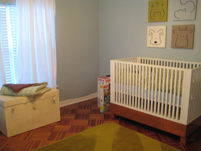
 I found Con-Man's crib still in the box, unused for 1/2 of what is was selling for in the store.


I also scored his dresser from Craigslist as well- it was a steal! All it needed was a new coat of white paint and some new hardware.


I found my awesome dining chair on CL for $30-


I didn't buy these off CL but it's how I found the store that I bought my other chairs from:


We've also been able to sell a lot of stuff on CL as well. When we renovated our Kitchen were able to sell the old sink, some of the cabinets and when we bought a new washer and dryer we sold the old ones on CL!

But be aware that not everything is all glitter and rainbows.


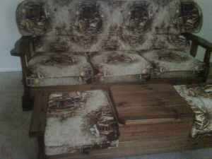
For example- the heading on this lovely set was something like- "Vintage Couch  and Table Set Solid Wood Frames!" Sounds promising right?


Wrong so wrong. That is NOT what I was expecting! :p


Oh, nice shade of pink. I believe this one had a title of "Nice couch". It's not horrible but the color is pretty bad.

I've found that it pays to be wary of things with the word "Nice" in them. "Nice doesn't mean the same thing to everyone. But for the most part you can find some pretty unique stuff if you take the time to look.

Hopefully I'll find a pair of chairs to finish off my dining set soon!